Legal tech · Product design · Information architecture · Reusable components

A challan page redesign. A reusable system for legal services.

I redesigned the first step, reorganised the content, and built the Figma components the team could reuse.

Project overview

DigiLawyer

I owned the concept. The team extended it.

I was brought in to investigate friction and weak lead generation across DigiLawyer’s service pages. Starting with the challan page, I redesigned the experience around the visitor’s immediate task: checking a vehicle’s pending challans.

The work expanded into reusable Figma components that developers implemented in code. Product owners then used those shared sections to assemble additional pages with the content and SEO teams.
Monthly active users

50K+

Paid transactions

3,200+

Leads generated monthly

3,000+

Month-over-month lead growth

20%

My role

Product Designer

Company

DigiLawyer / BigOhTech

Timeline

1 month

My ownership

Concept, information hierarchy, page layouts, and master Figma components

Collaborators

Content, SEO, product owners, developers, and the CEO

Research

Page audits, PostHog recordings, interaction analysis, and competitor review

Scope

Challan redesign and reusable PDP, PLP, and use-case sections

What these figures cover. The four above are DigiLawyer product figures. The GA4 snapshot in Outcomes covers the challan page alone, over one reporting window, and the reports do not isolate this redesign’s contribution to either set.

01 · Context

Keep the content. Change what comes first.

DigiLawyer’s product detail and listing pages contained extensive information about its legal services. During my initial audit, they often felt like articles: long explanations competed with the information visitors needed to evaluate the service and take action.

Core challenge

Make the service easy to start and the supporting information easy to find.

Content and SEO needed those sections and keywords for search. So the constraint was hierarchy, not deletion.

Where it started

1 page

I started with the challan page because it offered a specific task around which to organise the experience.

Placeholder

The old service page at full length

A long scroll capture showing how much explanation ran before the first action. This is the evidence for the word “articles” above.

The page as it was: explanation first, action somewhere below the fold.

02 · Problem

The page explained the service. The form started a consultation.

Visitors arriving to check their challans met a form asking for name, problem statement, phone number, and preferred time slot. The vehicle number was not the starting point, and violation examples, benefits and badges competed around it.

The entry point before the redesign: four fields, none of them the vehicle number. A recording of the previous page, with no sound.

Three problems to address

No clear priority

Essential service information competed with lengthy explanations and multiple messages.

A mismatch in the first step

Visitors needed to check a vehicle, while the form collected consultation details.

Interaction friction

Session recordings revealed responsiveness issues in the form, alongside repeated clicks and drop-offs.

03 · Users

Design for the task the visitor arrives with.

I used the visitor’s task to guide each page format. These groups describe the needs addressed by the designs, rather than interview-based personas.

Check pending challans

What the page needed to provide: A prominent vehicle-number entry point.

Find the right legal notice

What the page needed to provide: Search, categories, and relevant service options.

Evaluate money recovery help

What the page needed to provide: Service details and situations where it could apply.

Address an unpaid loan to a friend

What the page needed to provide: Contextual information and a relevant enquiry form.

The shared structure needed to accommodate these different starting points.

04 · Pain points

The audit found one problem. The recordings found another.

I reviewed individual pages, watched PostHog recordings, examined interaction patterns, and compared competitor structures. Discussions with content and SEO established what the redesign needed to retain.

Dense explanations and competing messages

How it shaped my decisions: Prioritise the primary action and group supporting information into distinct sections.

Visitors moving around the hero before leaving

How it shaped my decisions: Investigate whether the offering and entry point were clear enough.

Rage clicks and form responsiveness issues

How it shaped my decisions: Treat interaction reliability as a separate implementation problem.

Fewer clicks farther down the page

How it shaped my decisions: Review where important information appeared.

Scannable, action-focused competitor pages

How it shaped my decisions: Explore a clearer first action and more explicit next steps.

The recordings established friction, but did not reveal every visitor’s intent. Lack of clarity and reassurance remained hypotheses; the form responsiveness issues were directly observable.

Placeholder

PostHog evidence: heatmap or a session recording still

The rage clicks and the drop-off point. Blur or crop anything identifying before you export.

Where the old form lost people. Recording evidence, not a design mock.

05 · Design goals

Make it easy to start. Keep the detail within reach.

01

Start

Make the first interaction relevant to the service.

02

Evaluate

Make benefits, reassurance, and next steps easy to locate.

03

Explore

Keep detailed explanations accessible on demand.

04

Extend

Create sections the team could adapt to other services.

06 · Solution

Four decisions, each with a cost.

The opening ask

4 fields before you can begin

Clear Your Challan in Minutes!

  • Name
  • Problem statement
  • Phone number
  • Preferred time slot

Proceed

Describe an issue and request contact. Nothing here is the vehicle number the lookup runs on.

Schematic. An explanation of the field structure, not a screenshot of the product.

01 Match the first input to the task

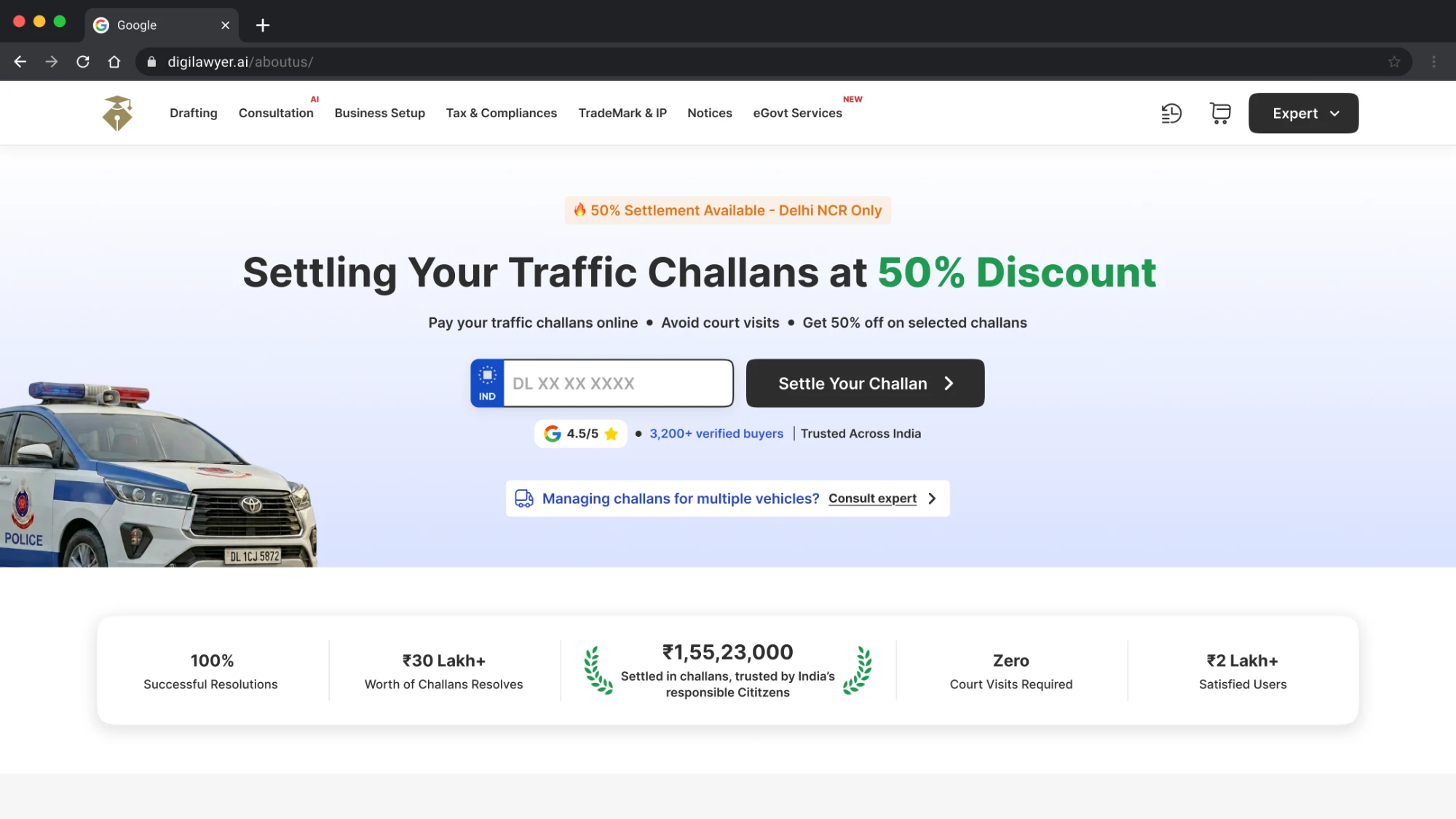
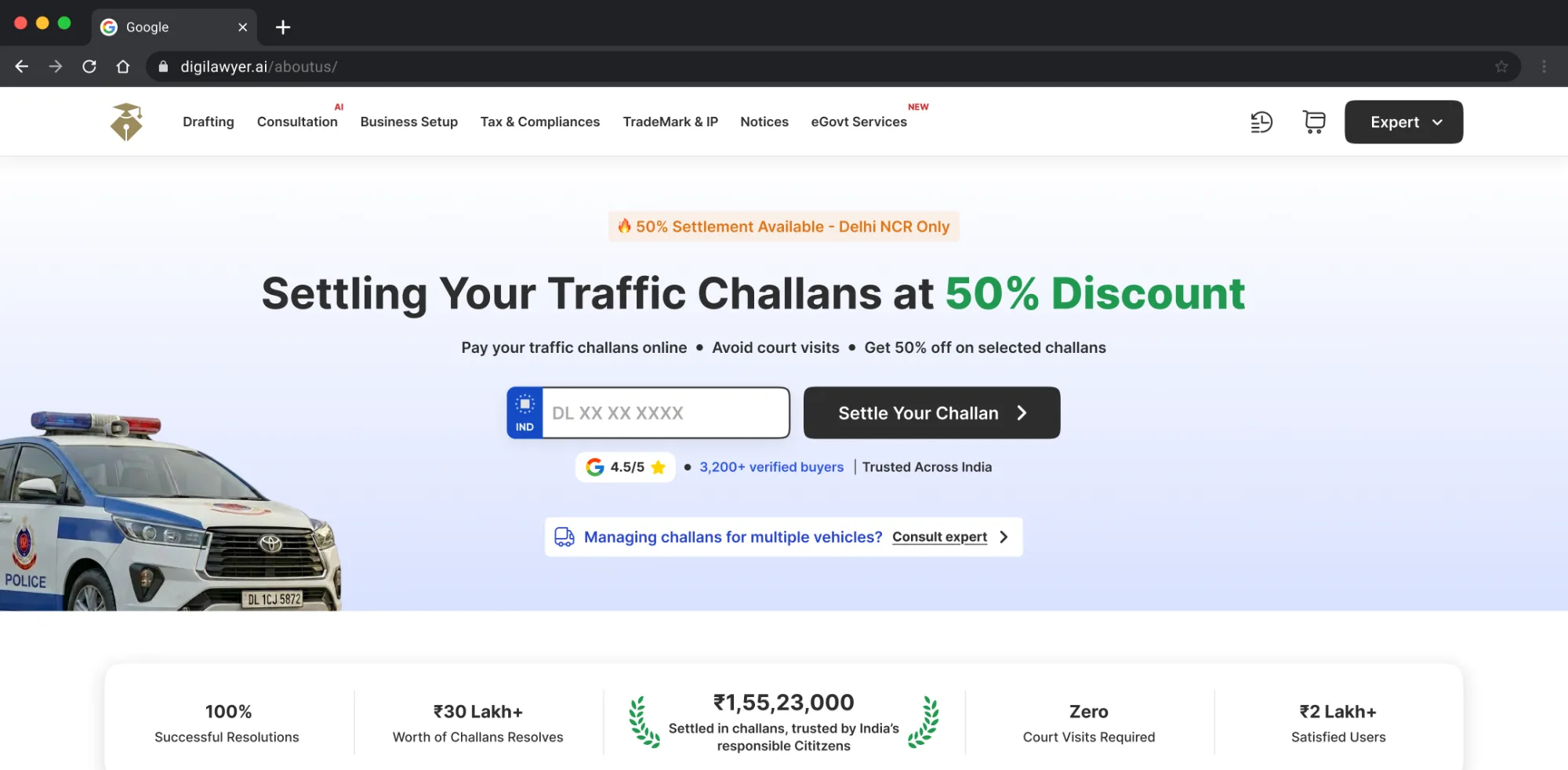
I replaced the consultation-style entry form with a vehicle-number field. The first input now supplied information relevant to checking challans, without asking visitors to explain their problem or select a consultation slot first.

What the reduction covers

The four-to-one reduction applies to the initial screen. Further information and resolution belong to subsequent steps.

02 Make the page scannable by purpose

I gave the offer, reassurance, process, and reviews their own sections. Each section had a clearer job: explain the service, support confidence, describe the process, or answer a question.

What was actually new

The older template already contained some of this information. My decision was to change its hierarchy so visitors could locate it without reading the page as an article.

03 Keep decisions visible. Expand the detail.

I kept the primary action, benefits, reassurance, and process on the main page. A concise introduction with “Read more” opened the longer explanations requested by content and SEO.

Visible on the main page

  • Primary action
  • Benefits and reassurance
  • Process and reviews

Available on expansion

  • Longer service descriptions
  • Detailed explanatory sections
  • Supporting tables and reference information

Trade-off

The key decision was what belonged in each layer. Hiding essential information would have recreated the earlier problem. The expanded view still contained substantial content; this approach changed when visitors encountered that depth. Its effect on search rankings was not separately measured.

04 Reuse the structure. Adapt the request.

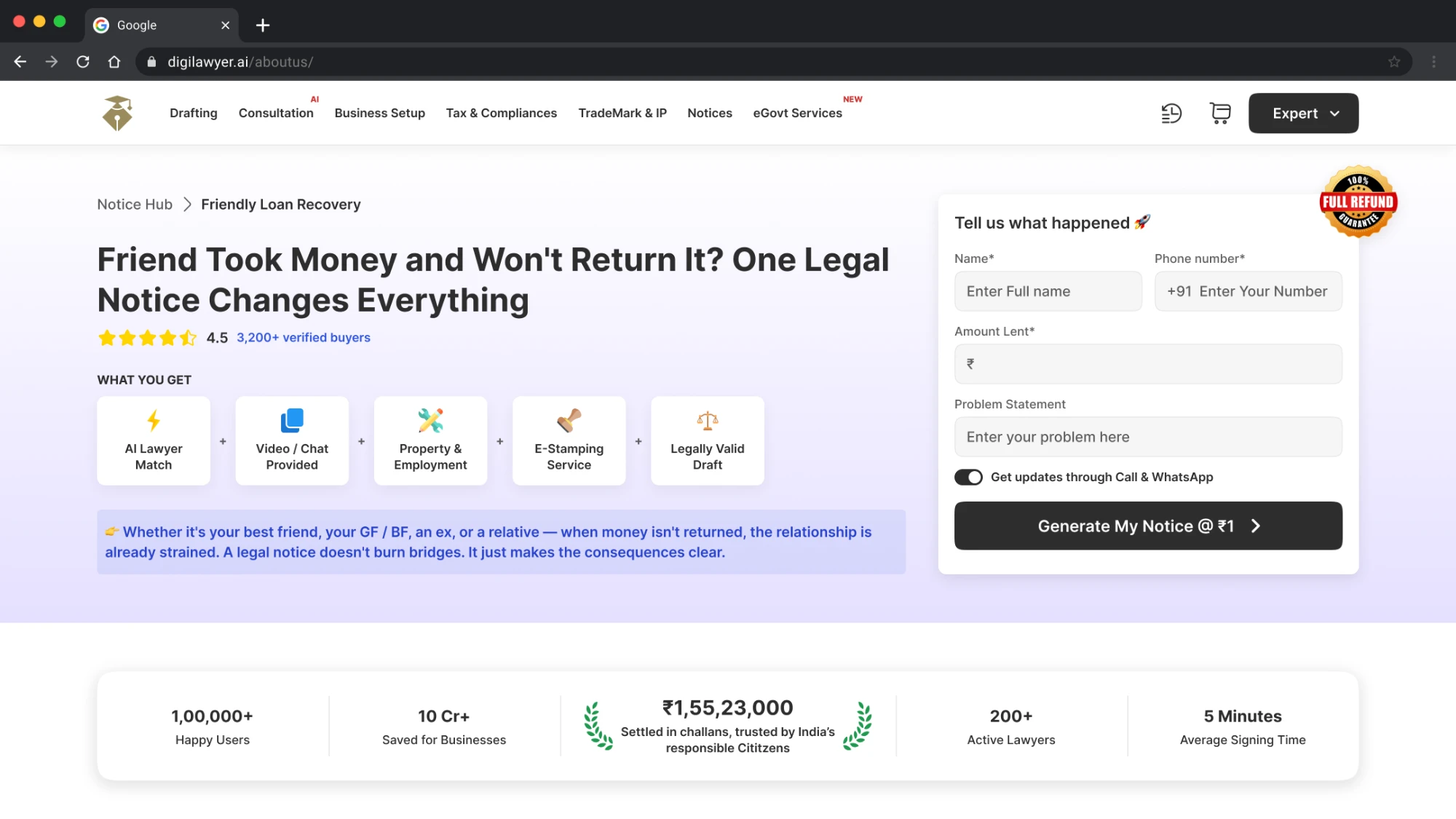
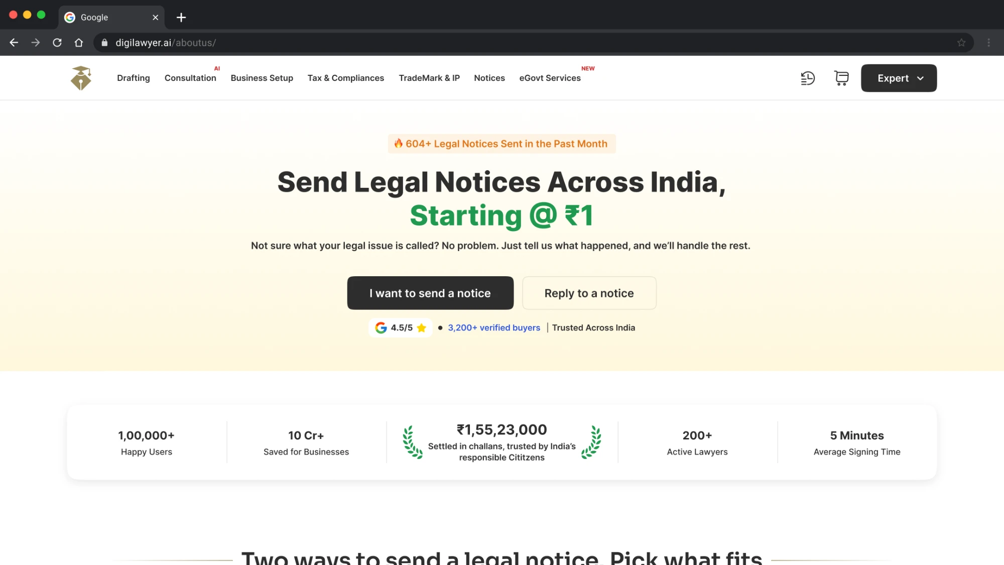
A vehicle number can start a challan lookup. A notice request needs context. For friendly loan recovery, the form included the amount lent and a problem statement: inputs relevant to that service.

Why one field was the wrong rule

The principle was a relevant first interaction. It did not require every page to use a one-field form.

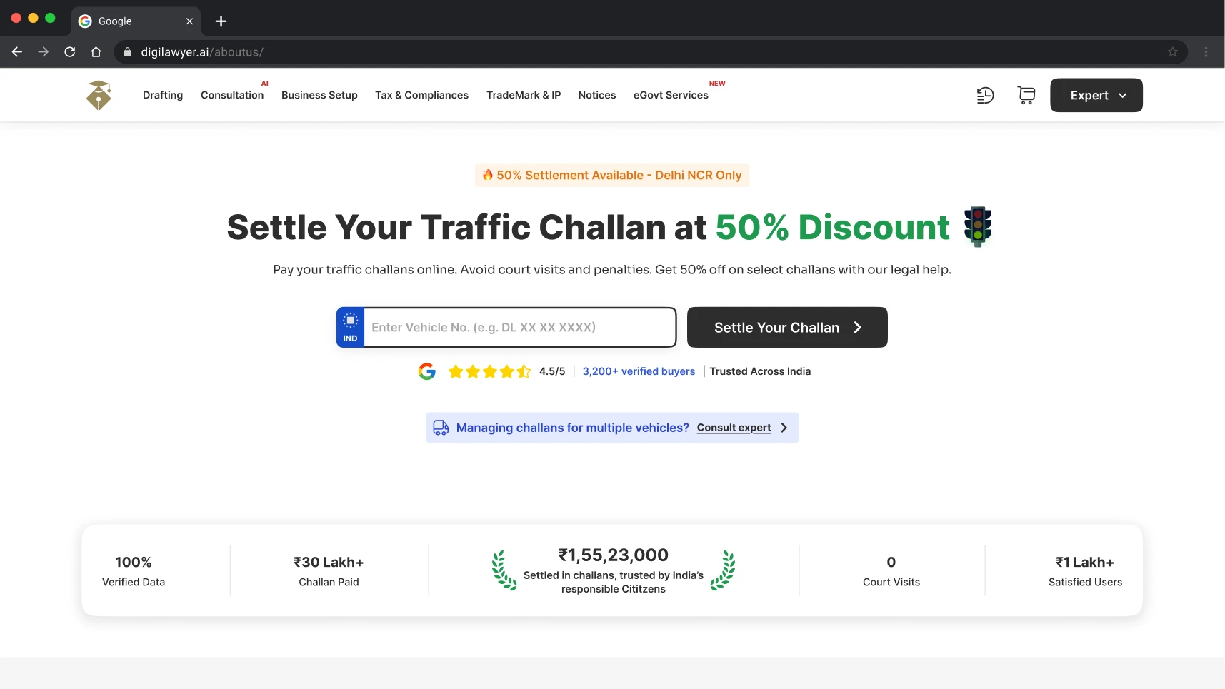
The top of the redesigned DigiLawyer challan page: a single vehicle-number field beside a Settle Your Challan button, above the results summary.
The redesigned challan page. The frame holds the top of it; open it full page to run through the section order end to end.

07 · Components

Turn page decisions into reusable sections.

After the challan redesign, I created a master collection of reusable Figma components. Developers built corresponding reusable components for implementation.

  • Service cards
  • Process steps
  • Testimonials
  • FAQs
  • Comparison sections
  • Location grids
  • Banners
  • Tables

Consistent structure, service-specific content

How three shared sections differ between two pages
Shared section Challan page Friendly loan recovery page
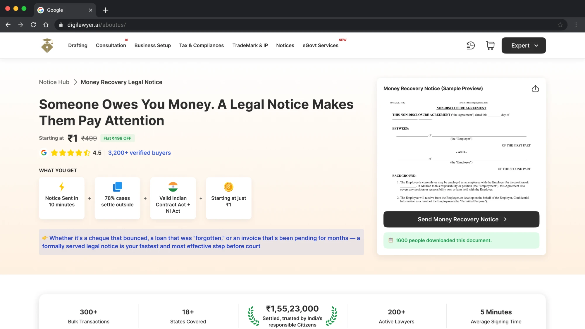
Process cards Three steps explaining the process. Four steps explaining what happens next.
Testimonials Reviews on the challan page. Reviews on the notice use-case page.
FAQs Challan-related questions. Questions about notices, delivery, and next steps.

The component structure stayed consistent while the content, number of items, and section selection changed.

About these images. Each is a browser capture cropped to the top of its page, so the structure reads at this size rather than the copy. The whole pages run far longer than the frame.

08 · Decisions

What each decision gained, and what it cost.

01 Vehicle number first

Benefit

A smaller, task-relevant initial ask.

Trade-off

Collect further information at the appropriate later step.

02 Expandable detail

Benefit

Less information displayed upfront.

Trade-off

Keep essential information visible and the expansion control discoverable.

03 Reusable sections

Benefit

Consistency across services.

Trade-off

Adapt forms, copy, and section selection to each task.

04 A stable structure with visual iterations

Benefit

Move a clear concept toward implementation.

Trade-off

Further testing would be needed to compare alternative structures.

09 · Process

I owned the structure. Implementation was shared.

I presented the concept to the CEO and received support to proceed. The direction came from the audit, recordings, competitor review, and discussions with content and SEO. The structure then held through the visual explorations.

My responsibility

Concept, hierarchy, page layouts, and Figma components.

Developers

Reusable implementation.

Content and SEO teams

Copy and search-related requirements.

Product owners

Assembly of some subsequent pages, working with content and SEO.

This collaboration carried the approach from one redesigned page into a shared way of creating service pages.

Placeholder

The handoff: specs, or the Figma file structure

Whatever engineering actually built against. Page organisation, naming, annotations.

What the developers built from.

10 · Outcomes

The work extended beyond my own pages.

Page formats

3

The approach supported listing, product detail, and use-case pages.

Reusable design and implementation

Figma + code

The Figma sections had corresponding components built by developers.

Team adoption

Product owners

They used shared sections to structure additional pages with content and SEO teams.

What I could measure

Challan page, GA4 15 July to 12 October 2026

Page views
11K
Active users
9.6K
Events
51K

Measurement context. The report carries a second, differently titled challan row of its own, at 5.9K views. Page paths and tracking consistency need verification before making a like-for-like comparison. Bounce and engagement rates are not reported here for the same reason: without a matching row in the earlier report there is nothing to compare them against. SEO, campaigns, seasonal demand and tracking changes may also influence the figures. The available reports do not establish a conversion improvement or isolate the redesign’s contribution.

Placeholder

The GA4 report the figures above come from

Crop to the challan row so the page path and the date range are both legible. This is what lets a reader check the numbers.

The source for the figures above, shown so they can be checked.

11 · Reflection

Give every piece of information a clear job.

Reflection

I learned to separate information that helps someone start, decide, or explore.

Hierarchy and reuse are the same problem

Working with content and SEO made that hierarchy practical. Reusable components then allowed the team to apply those decisions to other services, with forms and content adapted to each task.

What I would measure next time

I would define the funnel before rollout: consistent page paths, a recorded release date, and separate events for lookup starts, enquiries, and payments. I would also verify the form across devices and measure use of the expanded content. That would connect the design decisions more clearly to completed customer tasks.